The modern world is saturated with design: in particular our interactions with the digital world and its interfaces dictate our daily experience as users. Even the most design-agnostic individual can tell the difference between a well-crafted app and a navigational nightmare. As we become increasingly reliant on technology, the need for great design increases – just as a chef needs high quality knives and a functional kitchen to make the best food, so too do software teams need well-designed products to make well-designed software.
OutSystems does a great job in providing designers and developers alike with well thought-out, plug-and-play building blocks to rapidly take an idea through to reality. While relying solely on OutSystems to build a flawless, award-winning digital solution may not be realistic, its modular and intuitive workflow can take you much further than traditional web development or many other low or no-code platforms when creating attractive UIs with engaging UX.
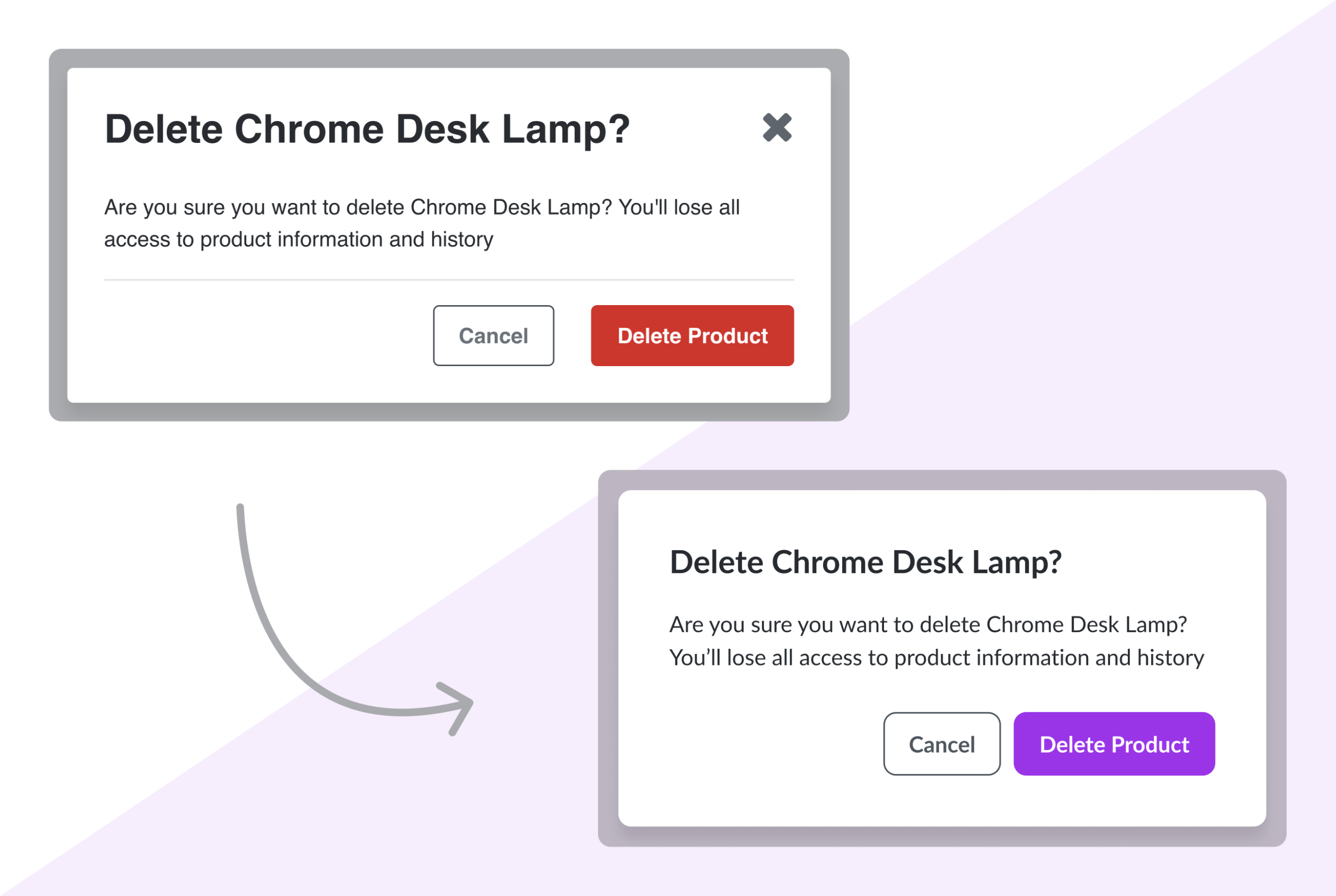
Customisation of existing patterns
Take for example, the popup. Out of the box, it’ll dot your i’s and cross your t’s, and you can slot it into your first draft without much alteration – it looks and works like any popup. You can, however tailor it to your brand; the image below shows updated spacing, custom typography and primary colour, and a UX decision to omit the cross to close the popup (instead, closing this popup by clicking the Cancel button, or clicking outside the popup).
What’s also great is how the alterations above can be done with only a few lines of CSS and possibly some Java Script for the clicking-outside-the-popup-to-close-it feature, and this will translate through to all popups across your app, unless specified otherwise. Simple CSS customisation like this allows even those with limited coding skills to do it without breaking a sweat. You don’t have to be software developer to make simple CSS customisations like this – in fact, the following code for stylising feedback messages was written in OutSystems by a designer with minimal coding know-how:
Interaction
So far, we’ve mainly discussed the visual, but what about the interactive, the human-computer relationship, the user experience part of things? OutSystems has you covered there too, with interactivity built into the components. Most often, customisation happens only on the front-end for UI improvements, like with the feedback message above. Back-end alterations are also sometimes made, as when a wizard is reworked so that users can click to previous states. The interactivity part of things, however is often left close to its original state, because of its comprehensive out-of-the-box functionality.
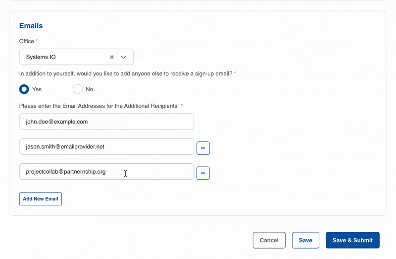
The dropdown tags pattern, for example, lets the user interact seamlessly with the system, letting one search, and add or remove tags as needed. The layout also responds well in terms of wrapping and shrinking around the user’s selection. It’s also easy to come up with new patterns by leveraging existing widgets, as we’ve done with input fields to create a component that lets users add or remove emails.
From design to demo in no time
Another perk that OutSystems offers to designers is the ability to speed up the prototyping phase significantly. You can rapidly build a proof of concept and have clients interact with it much sooner than with traditional web development, taking hours or days instead of weeks or months. You could even bypass the later wireframing stages and go straight to development with your design, although this is typically only recommended for when you’re in a pinch and you’ve got an established design library and can better predict requirements.
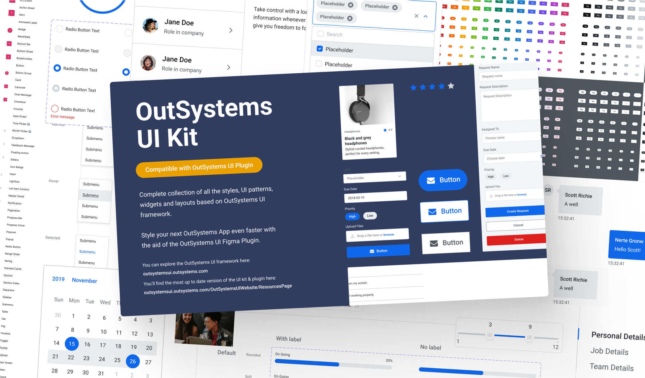
The Figma Community file with the full OutSystems UI Kit is an essential resource for designers, helping you align and speed up design processes, as well as grasping the key aspects of the OutSystems development workflow almost instantaneously.
Once a design library (also known as a Base Theme or design system) is ready to be implemented or updated, the designer can use the OutSystems UI Plugin to easily package the extended colour palette, typography, spacing and rounding for devs. This is neatly written up in code, containing the variables, the Root classes and so on – a great bridging tool to go from a Figma design file to a stylesheet in Service Studio within seconds.
Screen templates
When it comes to building screens, you have a few options: fully custom screens, fully default screens, or a mix of both. OutSystems offers ready-to-use screen templates for various scenarios, making the creation of fully default screens even simpler. These templates include options for dashboards, interactive maps, chart-based reporting pages and more.
Screen templates can help in two ways:
They can supercharge development time when the pre-built templates are utilised to quickly create your MVP – great for businesses relying heavily on OutSystems’ out-of-the-box features.
With customisation – the templates are ready-to-go by default, yet they don’t limit you to these base configurations; they’re malleable to fit your needs and preferences.
In conclusion
It’s crucial nowadays to consolidate your digital products with effective design. OutSystems provides software development teams, from design to development, with a foundation that allows for this rapid transformation. To the designer who seeks a glimpse into the rapidly evolving world of low-code; get started with the OutSystems UI Kit on Figma. You’ll find an invaluable, well-thought out resource that provides a starting point for building an MVP from day one.
Build IT Now
Want to learn more about what we can do for your business? And how quickly? Go to the Systems iO services page or
Enjoyed this post? Stay updated with our latest insights, industry news, and exclusive content by following us on LinkedIn! Join our growing community of professionals and be part of the conversation. Follow us on LinkedIn and never miss an update!
If you would like to receive our newsletter direct to your inbox, simply sign up at the bottom of this page.