How do you choose the right method to reveal the full picture of your user experience?
In the fast-paced digital landscape, every detail counts. Users expect seamless, intuitive experiences and are quick to leave platforms that fall short. So, when a solution doesn’t meet business goals or engage its audience, a systematic UI/UX audit can help pinpoint where improvements are needed.
A UI/UX audit isn’t just a surface-level check; it dives into the intricacies of design, usability, accessibility, and user behaviour to create a well-rounded understanding of the interface’s performance. This holistic approach provides actionable insights that guide design refinements and strategic enhancements, ultimately creating more engaging and effective digital solutions.
What is a UI/UX audit?
A UI/UX audit is an in-depth evaluation of a digital solution’s user interface (UI) and user experience (UX), aimed at uncovering usability issues, design inconsistencies, and obstacles to user engagement. Its purpose is to assess how effectively the solution meets user needs, ensuring that the design is intuitive, accessible, and aligned with business goals.
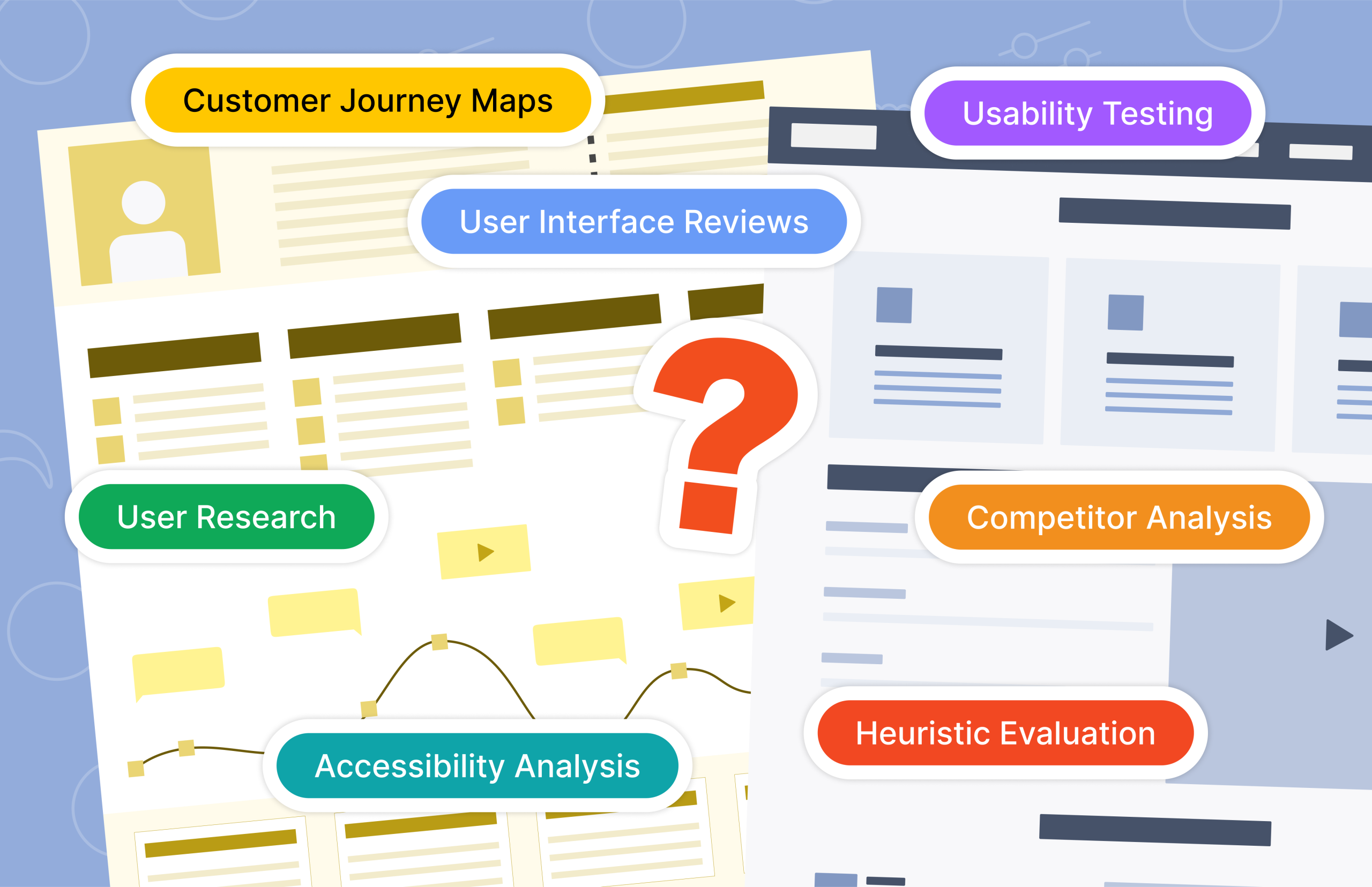
Each solution is unique, so the audit may incorporate a variety of methods, each providing insights from different perspectives:
User Research Analysis
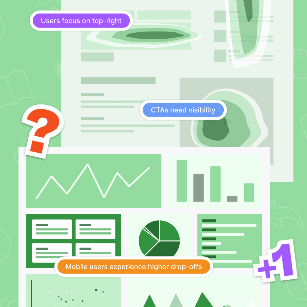
By reviewing quantitative and qualitative data from users’ interactions and feedback, this assessment provides valuable insights into user behaviour. Metrics such as click paths, heatmaps, time spent on tasks, and survey feedback reveal where users encounter difficulties, common pathways through the application, or elements that may detract from the experience. This data-driven approach helps teams make adjustments that better meet user needs and preferences.
Heuristic Evaluation
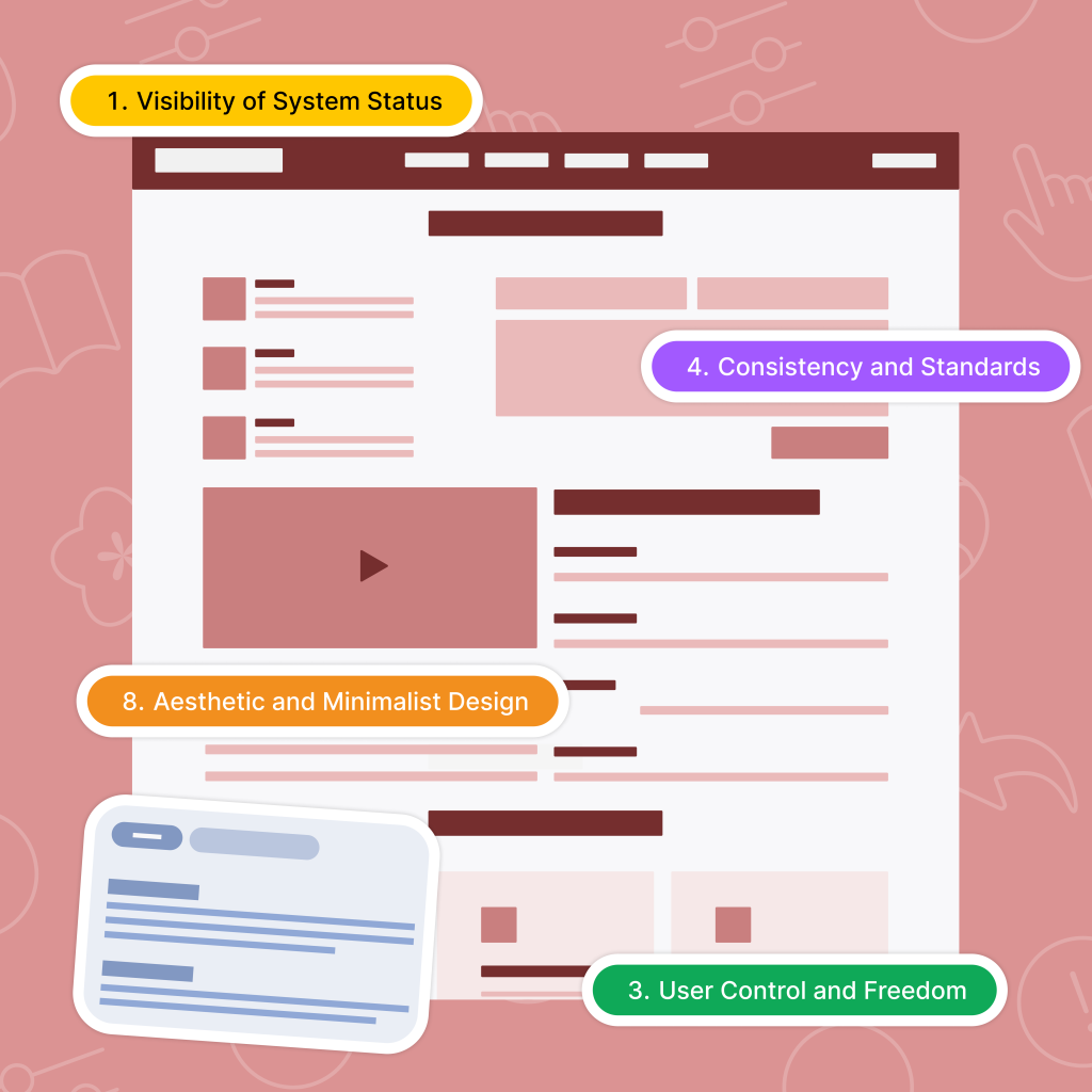
Evaluating a product against established usability principles, or heuristics, enables UX specialists to identify usability issues quickly. This approach, independent of user feedback, examines aspects like visibility, user control, and error prevention. By using this evaluation, teams can detect design inconsistencies and areas for improvement that impact user experience, particularly helpful in identifying issues early and reducing costly errors. Read more about Heuristic Evaluations in the Part 1 blog.
UI Review
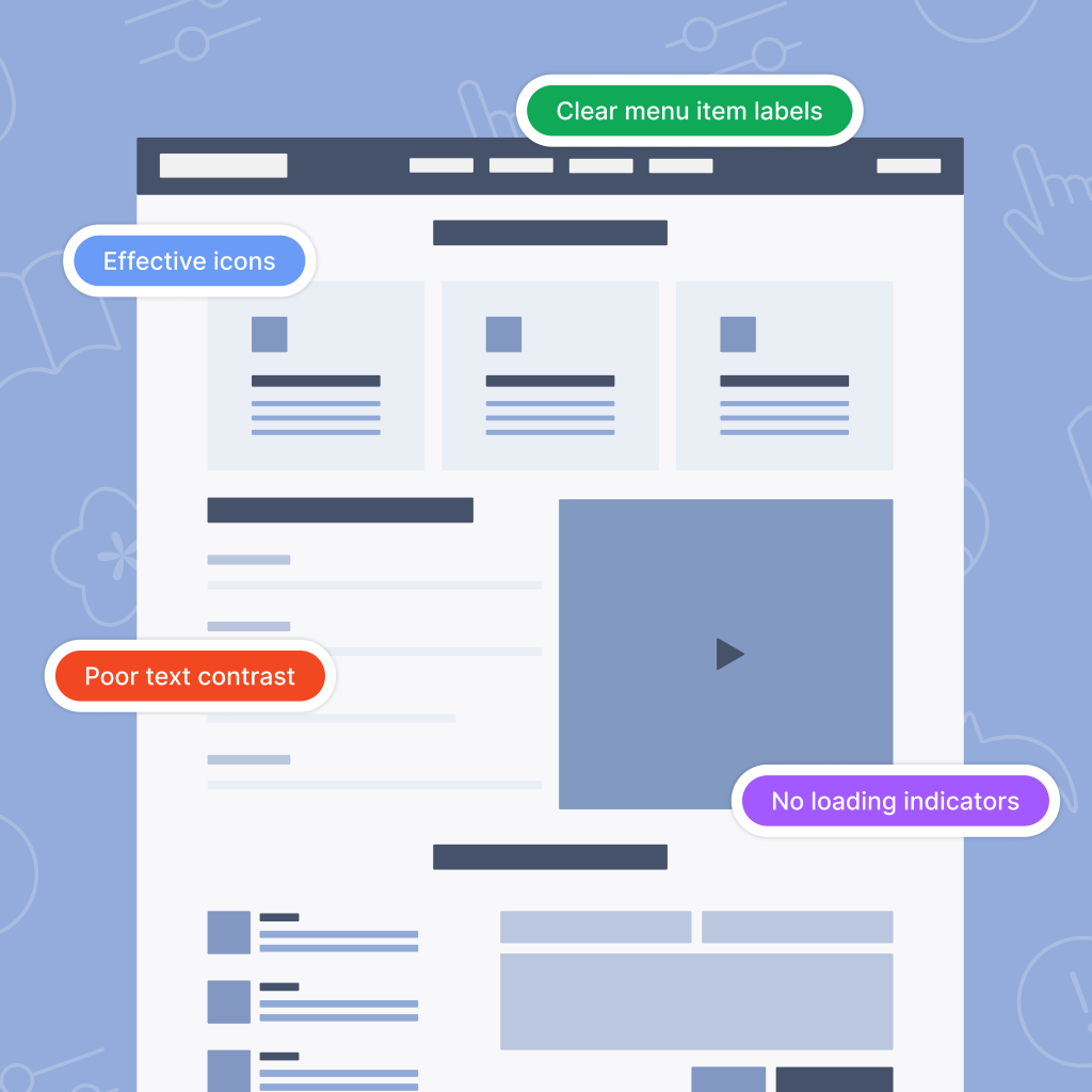
Examining the visual and interactive elements of an interface ensures consistency, visual hierarchy, and adherence to design standards. This assessment focuses on typography, colour schemes, button styles, and spacing to align them with the brand and enhance usability. A thorough UI review can uncover visual clutter, design inconsistencies, or unclear elements that may lead to user frustration, ultimately refining the aesthetic and functional quality of the interface.
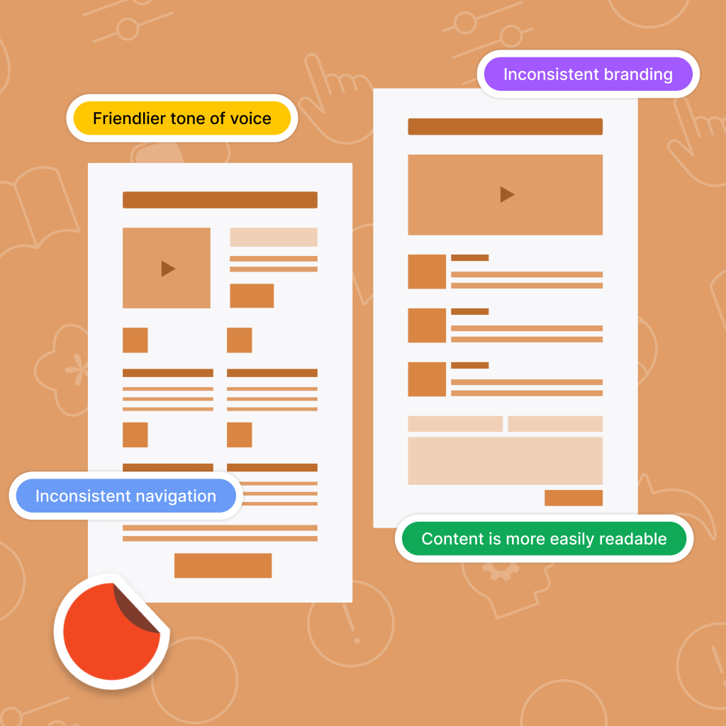
Competitor Analysis
Analysing similar products in the market helps identify industry standards, competitors’ strengths, and areas where they fall short. This approach offers opportunities to differentiate your product and adopt best practices. Insights from competitor analysis inform design and feature decisions, positioning your solution competitively and highlighting elements that set it apart in the user experience.
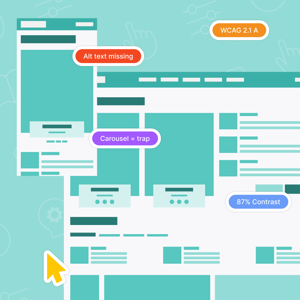
Accessibility Assessment
Ensuring a product’s accessibility makes it usable for people with varying abilities by assessing elements such as alt text for images, keyboard navigation, screen reader compatibility, and colour contrast. By focusing on inclusivity, this assessment broadens the product’s audience, improves usability for individuals with disabilities, and enhances the experience for all users.
Usability Testing
In usability testing, real users interact with the product to complete specific tasks, either moderated or unmoderated. This hands-on approach reveals usability issues that may not be apparent through other methods, providing insights into the product’s intuitiveness. Observing user interactions allows teams to understand pain points, task efficiency, and areas of confusion, enabling targeted improvements based on real user feedback.
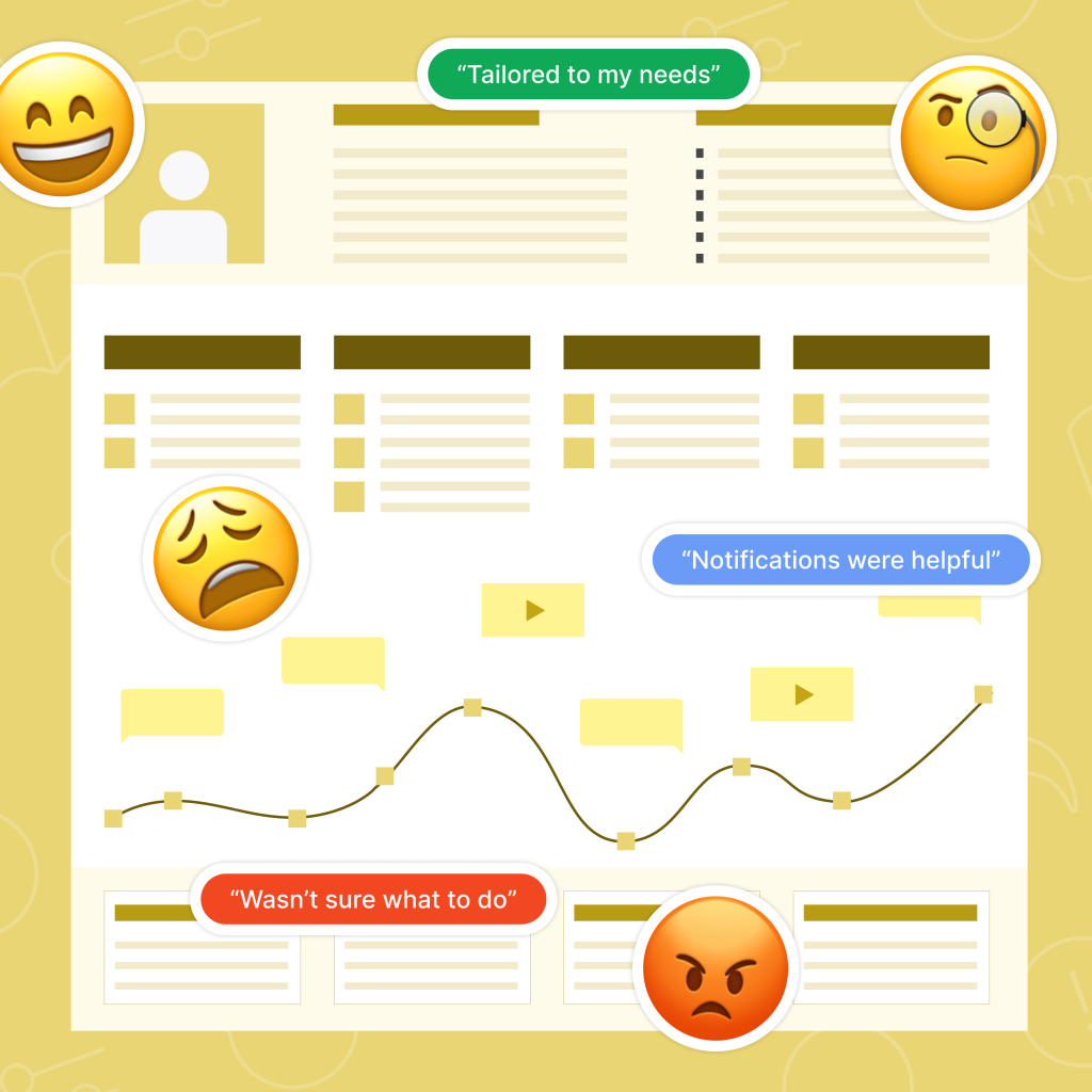
Customer Journey Analysis
Mapping out the entire experience of a user from the initial interaction to the final goal offers a holistic view of the journey. This analysis, often based on interviews and observational data, identifies each stage of a user’s journey, including points of frustration, satisfaction, and potential drop-offs. By understanding the end-to-end experience, teams can address specific pain points, creating a more cohesive and satisfying user journey.
Benefits of a comprehensive UI/UX Audit
By using a combination of these methods, a UI/UX audit provides more than just a list of issues—it creates a blueprint for long-term improvement. Here are some of the key benefits:
- Enhanced User Experience: systematic evaluation of usability and design creates a smoother, more enjoyable experience that drives user satisfaction and engagement.
- Higher Conversion Rates: refining the interface with user needs in mind removes friction, making it easier for users to complete desired actions, like making a purchase or signing up for a service.
- Cost Efficiency: early identification of usability issues saves on the cost of redesign and minimises the need for extensive customer support, helping maintain project budgets and timelines.
- Informed Design Decisions: insights gained from audits empower teams to make strategic, data-driven decisions that align with user expectations, ultimately making the product more competitive in the market.
Conclusion
UI/UX audits are a powerful tool for understanding and enhancing digital experiences. By combining various evaluation methods, these audits reveal insights that drive meaningful improvements in usability, accessibility, and overall design quality. Embracing a thorough audit process allows companies to create products that not only meet but exceed user expectations, establishing a strong foundation for ongoing success.
Build IT Now
Want to learn more about what we can do for your business? And how quickly? Go to the Systems iO services page or
Enjoyed this post? Stay updated with our latest insights, industry news, and exclusive content by following us on LinkedIn! Join our growing community of professionals and be part of the conversation. Follow us on LinkedIn and never miss an update!
If you would like to receive our newsletter direct to your inbox, simply sign up at the bottom of this page.
